We’ve worked with Remi Cachet from the early days, and in 2016 they decided to make a change and elevate the branding. Working with the same brand agency that created our branding, we created a brief that originated with a new logo design and a brochure as the priorities.
Logo
We knew pink was our hue. It gives us a point of difference from our competitors, who all, more often than not, opt for black, white or gold. And, while we don’t deny that these are all luxurious hues, we like to go against the grain and be a little different. Two hues of pink were created to complement one another, also allowing for some variation in the number of materials we needed. When it came to the heart, we noted we always shortened Remi Cachet to “RC”, with hashtags like “#RCGuru” and “#RCSuperStylist”. Knowing the main logo was large and, when scaled down, it was unreadable, the sister logo “RC” was created.
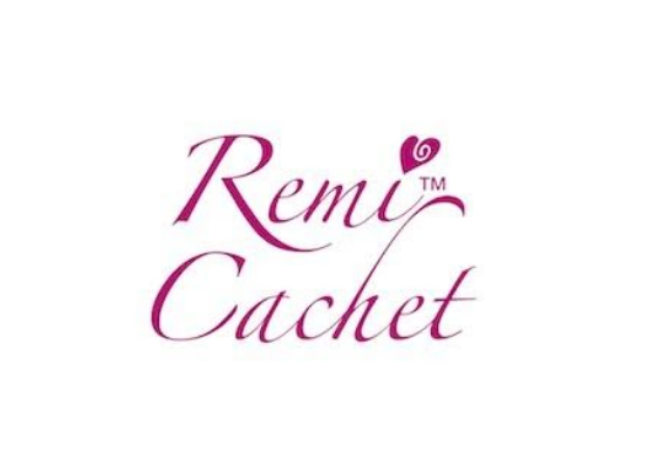
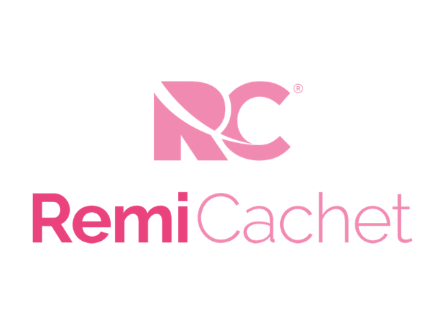
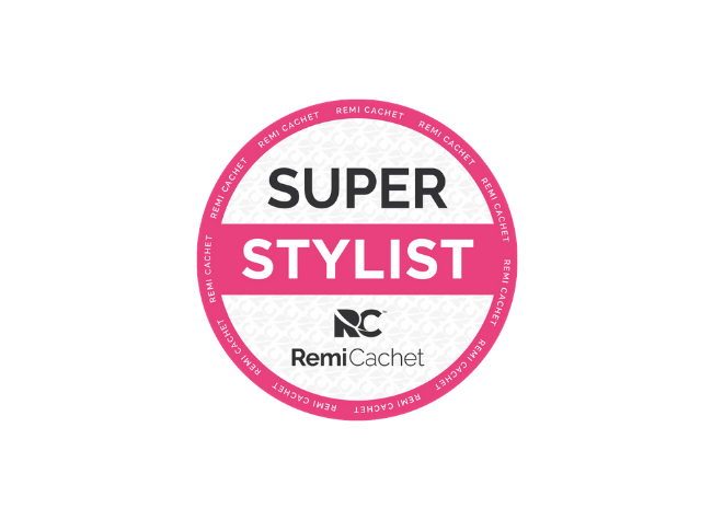
Variations of the logo in different formats and colours were essential. Considering that three years have passed since the rebrand, and the way branding evolves, it’s no surprise that these logos have been tweaked. The change from TM to R, for example. Then creation of two further logos for the Super Stylists and the Exclusive by Remi Cachet hair range, where foiled silver was selected to stand out on the handful of materials where it is used.
Brochure
This would be the very first Remi Cachet brochure, and we had a lot to say. Knowing that the print run would be large and that a couple of items were in the planning to be changed, we included inserts at the back of the brochure to allow for prices and new colours to be added easily without impacting the main brochure design.
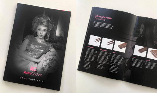
Defining the key messaging and copywriting was down to ourselves, as well as selecting the imagery. Where needed, additional product shots were created for consistency. With strong model images and our two brand pinks needing to stand out throughout the copy, banners and key pages, we settled on an all-black background, allowing the colour to really pop.
Liaising with the print broker right at the beginning allowed us to get the design in on budget, the right materials for the feel we wanted and a certainty that it would be produced on time.
With several print runs under our belts and tweaks made to the inserts, plus new imagery added annually to the brochure, the brochure has served well.
Other materials created in a similar theme include the aftercare leaflets and our POS stand, RRP Price List, packaging and, more recently, the Samples Pack, which includes several hair extension samples.
Advertising
With a new premium brand image, two campaigns evolved to be rolled out across key trade titles in both print and online, and later added to selected consumer titles. With one strong image, gorgeous hair and minimal copy, the ads had a stronger impact in getting the brand name out there. The original strapline “#GorgeousHairIsAChoice” helped us convey the message of beautiful hair created by buying the quality of hair Remi Cachet was known for. The later campaign “Form a Deeper Bond” refers to the application methods and relates to the emotional attachment consumers have for their hair extensions.
Social
Continuing the brand online with the pink hues has worked to great effect, and brings the brand to life in a way that extensionists and consumers can understand, aspire to and engage with. Graphics are created in the trademark pink and with the shorter “RC” logo to bring consistency and when shared, to spread the branding. Using these for quotes has worked particularly well.
Branded Goods
The new logo and, where possible, the pink colours were rolled out across the range, including their aftercare products, brushes, gowns, tools and merchandise. Some of our most popular gifting merchandise includes lip balm, pens and, more recently, the hair towel and shower caps.
Exhibitions
Exhibition designs have changed from stands selling products to brand awareness and education messages. We consulted on the design and assisted in planning for shows.